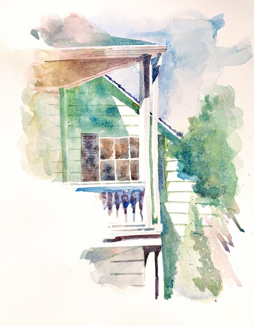
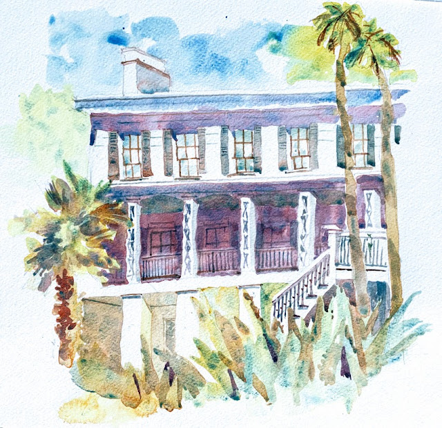
Posts

Showing posts from June, 2019

Studies

Image
Sometimes, after a series of studies, a bigger painting just doesn't work out. It is discouraging, but if it stays in my mind as a composition, for the shapes or the color palette, even for the name I may already have given it (!), then it deserves to be tried again, maybe after a few days or weeks. This is a lovely temple - San Jose Buddhist Church Betsuin - that I have painted before. In this view, I envisaged the temple in mostly cool neutrals offsetting a monk coming down the steps, dressed conveniently and complementarily in orange, with an orange umbrella. I did a few studies - here they are. The larger painting (not shown) didn't work out - I think impatience was the reason, or perhaps pressure to succeed. Both terrible ingredients. When it does happen, it will be called "Walking Meditation."

White is a color

Image
I have realized that the paintings I am most drawn to - have some sparkling white of the paper in them, - have irregular edges - the shape of the painting doesn't reach the box the masking tape makes, - have glorious watermarks. Since I am drawn to these components, I need to push my work to have these components. Often, I don't see much white in the photo I am using for inspiration, and before I know it, the resulting painting looks grim and middle-valued, without the extreme ends of the value spectrum. "Push the values," they say, and there is no reason to not invent the whites, and push the darks to be darker. One other experiment I thought to do is to draw the shape of the linked whites, like a serpentine through the picture, and see where that takes me. Maybe a series of vignettes is in order. I did this today en plein air at the gorgeous Sunnyvale Heritage Museum, surrounded by a lush orchard of ripe apricot trees. We enjoyed some fresh fruit after lunch

The parts, the whole, and the journey

Image
I was making a list of exhibitions and shows my work has been in, starting from my very first display through Peninsula Outdoor Painters (POPs) in December 2016 right after I started watercolor. As I was listing each venue, I realized it was quite a list. I would have severely underestimated the number if anyone had asked me to guess. It is good to be out there, for the work to be out there, for public consumption and reaction, and for the feeling that comes with the work being open to everyone like that - awkward, "I'm not good enough" at first, then mixed feelings about some early work, next to later, much better work, and finally being fine with the entire body of work, some good, some not so, but all out there, in its evolution for everyone to see, and being comfortable with that display. Quite an evolution in internal feelings about the display, as well as evolution in the work. So, as I made this list, I realized something else quite startling. The list of venues

Alaska Watercolor Society ... and a story

Image
I had a painting accepted into this juried show - the juror was no other than Frank Eber. Only 25 paintings were accepted. I was so thrilled, so honored. When I got accepted, I wondered if the 50-word description they required for each submission helped enhance my entry. I enjoyed writing this description - it made me think about the whys, and it gives the viewer a little story to go along with the painting, instead of just the title. I was responding to the cold weather when I chose the color palette for this architectural subject. I welcomed the bright sun for enhancing the brilliant whites of the building, which I left unpainted, but did little to warm me as I painted this en plein air. Going forward, I am thinking I will use such a 50-word story to describe my work. Just the title doesn't seem enough. Just a few days ago, just the location in the title wasn't enough. Now, even a clever title doesn't seem enough! How things evolve. Each day brings a new perspective,

Serendipity

Image
Today, Thursday, was a paintsite day with the watercolor group. Finally, finally, finally, after looking at the Chinese tower of Maryknoll from the freeway - almost daily, I glance to see what the shadows are doing, and almost daily, I wonder how to get that viewpoint from a place other than whizzing past on a freeway - Maryknoll was today's scheduled paintsite. Though I knew that I wouldn't get quite that freeway view, I was nevertheless excited to be painting architecture. Here is the painting - I didn't even paint that tower. I was stunned by this view as I took the steps up to the Maryknoll campus from the parking lot. I should have played up the mediums and darks to bring out the beauty of the tops of the curved walls getting direct sunlight which is what drew me. I should have designed my shapes and assigned better values - this looks washed out, though I am happy with the color harmony, and the gentleness of it. While I was painting, a man who lives in this retirem

Awareness

Image
In meditation, they say that the monkey-mind wanders, and when you find it wandering, bring it back to the breath, or the body sensations, or whatever your attention needs to come back to. That the act of bringing back your mind to meditation, and not letting it be dragged by thoughts and the wandering mind, IS the meditation. Similarly, many times, I start a watercolor, and simply dip my paintbrush into the next color, then the next, a stroke here, and a stroke there - more instinctively - without a true awareness of what I am doing. I wonder how it would be different if I was truly aware - if I truly looked at the painting in progress to see what it needs, and with awareness, fulfilled that need. If I had a reason for choosing that blue-green - instinct is fine, but I should be able to back it up with a reason if someone asked - is it a complementary color to the one next to it, is it warm next to a cool? - what if I mentally verbalized why I was doing what I was doing, to tell mysel

Je ne sais quoi

Image
I found some pictures I had taken late last year at Rancho San Antonio Park - the trails were backlit, and it seemed to be early morning winter light. To capture a building or a "thing" is so much easier! The shapes I saw in these landscapes looked easy enough, but to capture that light, color, and all the values as they transformed gently but surely into other values - misty somewhere, bright somewhere, fading somewhere, in silhouette elsewhere - was much harder than the shapes implied. Here is my first attempt - postcard-sized as I really wasn't feeling brave - and all the original pictures I took. The pictures are so stunning - I can't believe I was there. The second painting is done with a complementary palette: the first layer is golds, oranges, and red-oranges. The second layer is blues and blue-greens; the third layer is darks - neutrals made with oranges and blues.

Creeping up

Image
I was driving to the paint site today (Casa Grande in San Jose) and passed by a cluster of mailboxes. Instantly, instinctively, my first thought was: how would I paint those? I would paint the light shapes, and then I would do all the darks. I knew there were three mailboxes, overlapping each other, but I had instinctively separated them into fields of the same value. When this happened, I realized that how I look at things has actually slowly changed. Similarly, in meditation, you are not working to change anything but you are simply meditating. Three months later, or perhaps six months later, you will find that you are not reacting to an event in the way the old you would have reacted. That change has slowly crept up on you and taken you by surprise.   Just paint, just meditate. Change will follow, surprise you, and transform you.

What's in a name?

Image
When I am thinking of a title of a painting I've finished, I often struggle between feeling a strong need to communicate the location of the painting to the viewer - I really want them to know where it was that I found this beauty - vs. a clever title that is perhaps a play on words, my feelings about the subject, and all the other things I might want to communicate to the viewer in a short phrase that is more than just the location. Lately, I have been thinking that the location is just not enough; that a title ought to be much more. Sometimes, the title creates humor [ "Orange Thingy at Coyote Point" got some smiles from multiple viewers at SVOS, AND I managed to sneak in the location!], evokes a certain feeling, brings forth a memory, makes a connection, might make you look again because it is revealing something you may have missed in the painting, and perhaps you might ask "Where was this?" It could be a conversation starter.  Just the location doesn’t tak

The right mix

Image
I was talking to someone about what makes a successful painting, and I found myself telling her that it takes    the right amount of confidence    the right amount of relaxed feeling    the right amount of time    the right amount of inspiration    the right amount of skill    the right amount of risk-taking When any of these parameters are missing, it is obvious and you feel it in your body i.e. the pressure to paint --> lack of time; not having a subject --> lack of inspiration; the low feeling after an unsuccessful painting --> lack of confidence for the next one, etc. When things are right, they just are, and everything feels right - in retrospect perhaps, after that successful painting. This is from last month - painted at Hidden Villa. It doesn't look as bad as it did right after I did it. The magic happened again.

Shadows in a Vase

Image
I bought these sunflowers at Trader Joe's. Yesterday, with the late afternoon sun, the shadows were very long, and to me, they were more prominent than the flowers themselves. What was fascinating was how the shadow of the transparent water rim became solid, yet the shadow of the transparent vase stayed transparent, and the water in the vase cast a semi-transparent shadow. All to do with refraction and reflection and Physics, I'm certain. I did a notan first which helped me work out the overall arrangement - the rightmost sunflower was at an odd angle, sticking out, and I thought I would eliminate it. But then, I felt the shadows of the arrangement were pulling the composition sharply down to the left with nothing to balance it. Back came that awkward sunflower - cover it with your hand and see how the balance shifts - and helps pull it back up towards the top right. More Physics, moments, balance of forces all come into play. Good ol' Newton. I need to do some apple stud

A ready subject

Image
I am most excited to paint when I know *what* I'm going to paint, even if it is a demo/tutorial from a book. It gives me an objective. Otherwise, I sit down to paint with no idea, no inspiration, no starting point - and it is days like these in which painting is left to the panicky end of the day. When I know what I'd like to paint, I'm usually excited enough that I get it in early. It is important to be aware of this - of how it affects my motivation. On the last day of my son's school before summer break, a bunch of school moms and I went out to lunch at a lovely light-filled Italian place. From my seat at the table for 7, I could see this. How momentous! I may have missed it if I was seated elsewhere. I have painted two versions (in the order that I did them) to try and be looser, but it is tricky - quick does not mean loose. Loose does not miss quick - Charles Reid was (yes, sadly, he passed away on June 1 - he inspires me constantly, and affects me constantly) ve

Interpretation

Image
The interpretation is the journey between a photograph or a scene and a work of art. It has to do with the artist and her play with the medium, and how she feels viscerally about the subject. Why does an artist choose a certain color palette - why this yellow over that - and why does she paint certain things and leave others out? How does she design the whites - within the painting, surrounded by paint, and at the edges - what shape are the edges? Do they touch the paper rectangle, or enhance the subject by pulling away from the rectangle as the subject demands? Is the final work beautiful as a stand-alone piece and does it provide closure, or does one wonder what the original subject was? This is from a photo I took on Highway 280 North as we were heading to San Francisco. There is a certain point on the freeway where the (back)light takes my breath away. Further up from this point, Hwy 92 curves and reminds me of my Site Design course in the Graduate School of Architecture: the

Middle Way

Image
In Buddhism, the Middle Way is the path that avoids two extremes. Not denial, nor indulgence. In watercolor, I have to find the right point, the perfect balance, between all the possible edges. Not too many hard, not too many soft, some lost, some found - the middle way. Edges are another whole topic in watercolor. To me, it is so exciting to discover a facet of this medium, and how deep it goes, how much information there is about it: composition, edges, color, how the eye moves, hierarchy of shapes. I am slowly getting an art education as I spend time exploring watercolor. And I feel I have the rest of my life to slowly learn it, slowly get better at it. This was done en plein air in our front yard this morning over my second cup of ginger-mint tea. It takes a lot of patience to work in layers - the basic overall shape first, then the carving out of darker blades and lighter blades of leaves, some in front, some behind, creating depth on the 2D sheet, a fair bit of negative paint

Timing

Image
The interplay between water and pigment depends on precise timing. I’m still learning how wet the paint needs to be before a certain effect will occur. Whether two colors will mingle just so, or stay stationary, depends on the wetness on the paper. Moist?  Damp? Glistening? Runny? The vocabulary has its own precise meaning to do with timing.  And tilting the paper at the right times allows the artist to mingle color with a little more control. Timing is everything in watercolor. And in life.