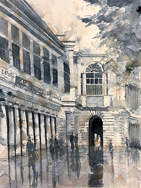
Interpretation
The interpretation is the journey between a photograph or a scene and a work of art. It has to do with the artist and her play with the medium, and how she feels viscerally about the subject.
Why does an artist choose a certain color palette - why this yellow over that - and why does she paint certain things and leave others out? How does she design the whites - within the painting, surrounded by paint, and at the edges - what shape are the edges? Do they touch the paper rectangle, or enhance the subject by pulling away from the rectangle as the subject demands?
Is the final work beautiful as a stand-alone piece and does it provide closure, or does one wonder what the original subject was?
This is from a photo I took on Highway 280 North as we were heading to San Francisco. There is a certain point on the freeway where the (back)light takes my breath away. Further up from this point, Hwy 92 curves and reminds me of my Site Design course in the Graduate School of Architecture: the cut and fill in the hills. 280 North becomes the upper shelf, and 280 South the lower shelf. Between the shelves, you can trace the slope of the hill, as it was before the cutting of the shelves.
This came out a little washed out. I was focusing on a complementary yellow/purple palette, and successive light washes to create transparent layers, leaving strategic whites for the freeway lane dividing lines. I have to focus on how to get the darks in a watercolor that is full of transparent layers of color by studying other work that draws me.


Comments
Post a Comment