Posts

Faith vs. belief, and inspiration

Image
In yesterday's Gita session, we discussed the difference between belief and faith. I found myself saying that a belief was hard-edged and inflexible, and faith all-encompassing and flexible and always positive - akin to having a big-picture trust in the cosmos. When I heard myself say "hard-edged," it made me realize how many terms and ideas are so interchangeable between the world of watercolor (art) and spirituality (life). When edges are hard, the eye stops at each edge before it goes to the next "item." It's like stop-and-go traffic. You are making progress but it is not smooth, not a flow. When edges are soft, your eyes travel easily, from one object to the next because the divisions between the objects are blurred, and the values do the talking. It is like life, like consciousness. We are all one - not so hard-edged and separate - yet we don't know it, and bump up against one another because of our hard edges, fixed ideas and notions, prejudices an

Design- vs. content-driven

Image
I've found that strong design-driven art is more attractive to me than content-driven paintings. Of course, the content or subject is there (unless it is truly non-representational work), but it is realized and recognized a split second after one has responded to the design. For this reason, subjects that lend themselves to being more easily abstracted - interiors, close-ups of anything, still life cropped just so - are more appealing than standard impressionistic distant landscapes where the shapes themselves tell you sky-earth-mountains-lake. A landscape can also be abstracted but I feel there is more effort in hiding or veiling landscape features for the slow reveal to happen. I've been working on this still life, and just starting with a notan helped me understand and crop shapes right away. Pushing some of the lighter shapes to the white of the paper helps with abstraction. Like a chess board where each shape is bordered by a contrasting value shape, or the way we typicall

Let the painting lead the way

Image
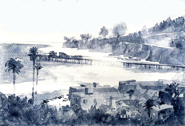
Speaking of titles, here is another painting I did in Capitola. When I first saw this scene, it looked quite black and white. It was late in the day, the sun was setting in the west (towards the horizon in this view), and was backlighting everything. I took a photo that was much more in silhouette than what my eyes could see - I could, of course, discern all the details in the shadows, which the camera doesn't pick up. Between what I could see, and what the photo showed me, I had a jumble of information in my head. I started with a small sketch in color, and it was pleasant, but something was missing. I did another one in different colors. Something, again, was amiss. Then I did a larger painting and started it in color. Midway, I abandoned it - the color seemed too garish. Then, the lover of value studies that I am, I decided to do this in grays. As I painted, it felt right. The painting was telling me: remember? I was backlit, and you liked me in silhouette? Paint me that way. Fo

What's in a name?

Image
Today, in my meditation, I had an insight. I was thinking about this painting that I painted (and sold) en plein air in Capitola a couple of weeks ago. Oh my! It's already been a couple of weeks! It feels much more recent. I recently read an article here about time and how/why it appears to go faster sometimes. More on that another time.... (no pun intended). I was thinking about the title of this painting, and I realized the title has to tell a story that one can imagine and be in. The title should do more than describe what is obvious in the painting itself, what the viewer can already see. For example, I could have named this, predictably, 'Light through the Trees,' or 'Shadows in a Forest,' or some such - which is what you already see in the painting. That is the first thing that might already occur to you as to what the painting is about. But calling it "Meet Me at the Fence" now has a story. A story of two people about to meet, and here is their mee

High and low

Image
The next assignment in the class was to create two value studies - one high-key and one low-key. It is one thing to know the difference (theoretical knowledge - I have a lot of that!) and another to be able to practice it. My photo, below, was low-key, so the value study was easy to do. Just copy the values - and exaggerate them a little to heighten the drama. Once I was done with the low-key value study in Payne's Gray, making it into a high-key was not so easy! It seems obvious now, but after reading Page 90 of "Powerful Watercolor Landscapes" by Catherine Gill, which I own, I understood that because the largest shapes take up the largest area, changing the values of those shapes alters the key of the scene.  I did a high-key study (not posted here) but it seemed like a washed-out version of the low-key. Although I didn't deliberately do it, I took each field and made its value a little lighter and there was my high-key study! It looked washed out, and worse, had no

A A E P

Image
When I meditate, and as I go through this journey of spirituality and watercolor which inevitably leads to self-discovery, I am finding more and more that following these principles in this order is essential in everything.  A A E P Awareness - Acceptance - Equanimity - Perfection I am still striving for the next level - to be a better person, a better artist - but the awareness of where I am right now is key. Right now, in this moment, I am aware of where I am. I accept where I am (which does not undermine the striving and the Big Plan for the future). I need to be equanimous with what I have discovered about where I am - not disappointed/dejected nor ecstatic/complacent - it is only in this moment that it is where I am. And finally, this moment is perfect . It is where I am meant to be in this moment. As they say, the present moment is inevitable. I catch myself thinking I love doing value studies - when will I ever get to the next thing? It is important to enjoy those value stud

Backwards journey

Image
We are so obsessed by the upward progress we make as artists, or want to make, that sometimes it is easy to forget that it is ok to go back and focus on basics. The more one knows, the more intelligent one feels, and the harder it might be to admit we don't know something basic from earlier in the journey. In all my learning about composition and good shapes, and the 4 edges of the painting, I forgot that one skill I haven't yet mastered is sticking to the value plan, and choosing colors to match the grayscale study. I can get ahead of myself with some very important aspects, and feel like I am understanding them and able to practice them. But if an earlier concept isn't mastered, what good will excelling at a later concept do? To that end, since I love doing value studies, I did this study en plein air last Sunday sitting on my front porch looking out into the front garden. I love the cluster of the four chairs encircled by a semi-circular hedge under the trees. The play o