White is a color
I have realized that the paintings I am most drawn to
- have some sparkling white of the paper in them,
- have irregular edges - the shape of the painting doesn't reach the box the masking tape makes,
- have glorious watermarks.
Since I am drawn to these components, I need to push my work to have these components. Often, I don't see much white in the photo I am using for inspiration, and before I know it, the resulting painting looks grim and middle-valued, without the extreme ends of the value spectrum. "Push the values," they say, and there is no reason to not invent the whites, and push the darks to be darker.
One other experiment I thought to do is to draw the shape of the linked whites, like a serpentine through the picture, and see where that takes me. Maybe a series of vignettes is in order.
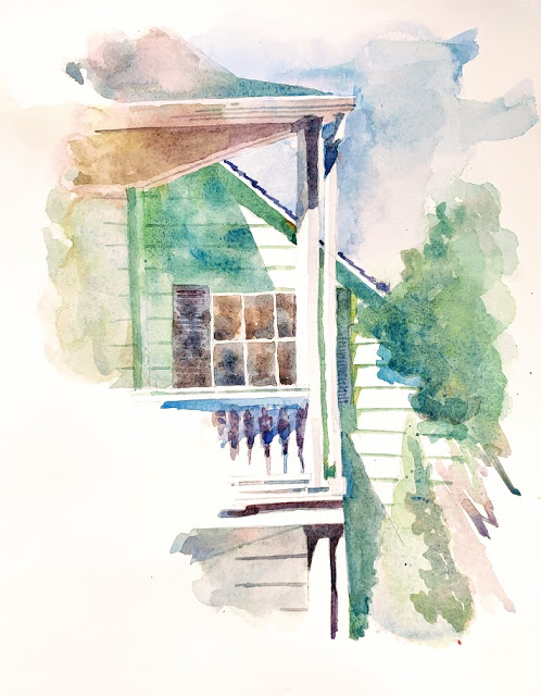
I did this today en plein air at the gorgeous Sunnyvale Heritage Museum, surrounded by a lush orchard of ripe apricot trees. We enjoyed some fresh fruit after lunch - one of us bought some cherries and apricots and we shared it.
I was drawn to the pointy triangles in the shadows. Even the white siding was jogging the shadow as it fell across its slopes to create mini jagged edges. This is just a collection of abstracted shapes, but we know what it is. That is the beauty of finding these gems on buildings. The value study, as always, is stronger than the painting. I don't know why I don't get to my darkest darks when painting.....

- have some sparkling white of the paper in them,
- have irregular edges - the shape of the painting doesn't reach the box the masking tape makes,
- have glorious watermarks.
Since I am drawn to these components, I need to push my work to have these components. Often, I don't see much white in the photo I am using for inspiration, and before I know it, the resulting painting looks grim and middle-valued, without the extreme ends of the value spectrum. "Push the values," they say, and there is no reason to not invent the whites, and push the darks to be darker.
One other experiment I thought to do is to draw the shape of the linked whites, like a serpentine through the picture, and see where that takes me. Maybe a series of vignettes is in order.
I did this today en plein air at the gorgeous Sunnyvale Heritage Museum, surrounded by a lush orchard of ripe apricot trees. We enjoyed some fresh fruit after lunch - one of us bought some cherries and apricots and we shared it.
I was drawn to the pointy triangles in the shadows. Even the white siding was jogging the shadow as it fell across its slopes to create mini jagged edges. This is just a collection of abstracted shapes, but we know what it is. That is the beauty of finding these gems on buildings. The value study, as always, is stronger than the painting. I don't know why I don't get to my darkest darks when painting.....


Comments
Post a Comment