Posts

Juggling

Image
In his book "Mastering Color and Design in Watercolor," Christopher Schink says this about the stages of artistic development: As an artist, you go through three basic stages of development. As a beginner, you have the greatest interest in gaining some control of the medium. In other words, just getting the paint to stick to the paper is an overriding concern, and producing a technically competent watercolor is a major achievement. At this stage, whether you have organized the color and design of your painting in an orderly or expressive way is of little importance. Unfortunately, some watercolorists never advance beyond this initial stage but continue to concentrate entirely on developing technical skills. Mistaking virtuosity for substance, they become better and better at saying less and less.  The second stage of artistic development begins when you recognize that control of the medium or even virtuosic technique will not produce an effective or satisfying watercolor. You...

Abstraction and the search of self

Image
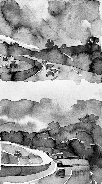
 I've been obsessively watching Ian Roberts' composition lectures and videos on YouTube. It's remarkable that the first time I came across him about 3 or so years ago, I watched a DVD from the library on "Mastering Composition." In it, he talked about the movement of the viewer's eye as it enters a painting, and how contrasts draw the eye around the art. It happens in such a fraction of a second that we don't know what our eye is doing. Yet, he claims, if you understand what the eye is drawn to, you can manipulate the path of that eye by creating contrasts and shapes where you want the eye to be pulled. I was fascinated - but I didn't understand a thing. About six months later, I checked out the DVD again, and watched it again. I could kind of see what he was on about - but I wasn't mature enough as an artist to feel like I had that kind of control. I was barely able to manage the medium!  Now, three years later, I came across his YouTube videos (w...

Color

Image
Lately, I've been fascinated by color, and had the realization that I would like to try to be a colorist. To me, that means working with colors that work very well together, and not necessarily what one sees in the scene or reality. I am reading Stephen Quiller's "Color Choices" book, and have decided to systematically do all the exercises in that book, no matter how basic they may seem at the outset. I did the first three, and learned a lot - to the point that I was amazed at how basic they seemed when I read them, how I almost bypassed them, and what I actually got out of doing them. I am also so very taken by Patti Mollica's work. Her YouTube on "Bending Reality" blew me away - the way she crops what she wants to use from a mundane scene, changes all the colors, keeps the value pattern strong, and creates this impactful and mindblowing acrylic - wow! And I am typically not drawn to mediums other than watercolor. Another artist, Doug Dawson, who works ...

Big take-aways

Image
I had some take-aways as I was sketching for the big version (10x12.5) of the thumbnail. I realized that when I watch an online demo of an artist working on a full sheet or a half sheet, on the screen, the paper looks small since it fits on the screen. You really don't know how big it is. The same way, as I view a thumbnail in my sketchbook from 6"-9" away and scrutinize it, a big painting cannot be viewed that way. I understood the importance of distance - like watching TV. You sit back some feet away, more if the screen is bigger. You need to approach the viewing of the large work the same way - it needs to be scaled. Essentially, when you view it from the right distance, it becomes no different than the thumbnail. It still has to work - the value pattern is foremost, the content or subject may not be discernible, and you evaluate it for the darks and lights that draw you in. I was very pleased with the sketch, so pleased that I was afraid to paint and ruin the sketch! ...

Patience

Image
I would say impatience is my biggest vice. From not being able to wait for little things in life, to not waiting quite long enough for layers to dry in watercolor, to wanting to improve by a big leap in watercolor tomorrow, I really am becoming aware of the times I do things hurriedly because of this impatience. I thought I was too impatient with doing multiple tries of the same scene. But I found that if it is the right scene with potential, a winning composition, and I feel I can get it in yet another try, I will keep painting it until I am pleased. Of course, as discovered earlier, multiple iterations help with the essence and help eliminate unnecessary details. In my morning meditation, I thought of the scene of the morning market on Kashmir's Dal Lake in Srinagar. I was very inspired to paint that. I started with a value study, then two color versions (one too dark), and then this that I was very pleased with. It is small. If I were to attempt it larger, I don't know what ...

Andy's workshop and gotcha!

Image
I read so many watercolor books and really enjoy all the theory. I understand everything in theory, but until I took Andy Evansen's online workshop in August, I thought a value study was a black and white sketch that you do before your painting. I didn't understand how the black and white sketch needed to be manipulated to arrive at the foundation that would BE the painting, and then followed with more loyalty than the reference image. With his workshop, I suddenly understood how the notan and the value study relate. The notan is a stark black and white graphic, if you will. Andy started by painting all but whites in a medium gray, and instantly, it looked like a notan. I got it! Then he added darks to the grey parts and lo and behold, there was a 3-value value study. I've seen Laurel Hart paint this way (in color), but I never connected her layers to the values as in Andy's value study. He also had us paint the color version alongside the value study, so we could rel...

Style and studies

Image
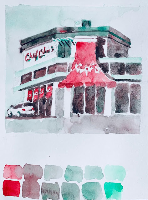
I am still trying to find my style - I hear it develops automatically over time, and you cannot search for it or "find" it. I do pause when I like a painting to see what it is about the painting I like. I love architectural subjects but I don't like every painting that features a building. I love transparent layers like Iain Stewart's work (and his color palette) but I also like Charles Reid's alla prima "one shot" style of painting. I do like a strong value foundation, but also appreciate high key paintings that have a lot of white space (Mel Stabin). Maybe it is the confidence I can see/feel in the painting, before the appeal of the subject? I am continuing to look for "ordinary" images and trying to do value studies and focus on my path of white, then apply color. I did the following in the layers' style, as well as the alla prima style (hardly washing the brush, just letting colors flow into another, keeping the values the same). I am ...