Color
Lately, I've been fascinated by color, and had the realization that I would like to try to be a colorist. To me, that means working with colors that work very well together, and not necessarily what one sees in the scene or reality. I am reading Stephen Quiller's "Color Choices" book, and have decided to systematically do all the exercises in that book, no matter how basic they may seem at the outset. I did the first three, and learned a lot - to the point that I was amazed at how basic they seemed when I read them, how I almost bypassed them, and what I actually got out of doing them.
I am also so very taken by Patti Mollica's work. Her YouTube on "Bending Reality" blew me away - the way she crops what she wants to use from a mundane scene, changes all the colors, keeps the value pattern strong, and creates this impactful and mindblowing acrylic - wow! And I am typically not drawn to mediums other than watercolor. Another artist, Doug Dawson, who works in pastel, also uses color schemes to create his art - and that is what I want to try to do with watercolor, letting blooms and watermarks have their way on a strong value pattern with a strong color scheme.
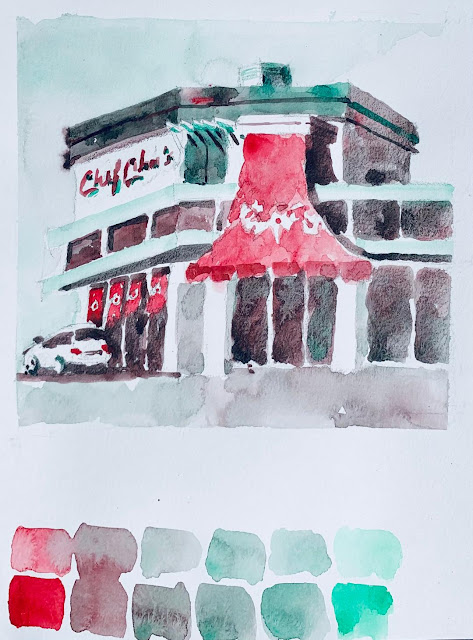
This all started to come together as I realized I could use two colors (a complementary pair) to create small paintings, instead of using Payne's Grey for doing value studies (which I love to do). That way, I learn about all the semi-neutrals that come with mixing the two colors, learn how to fade out the colors for lighter values, which I seem to know to do with Payne's Grey but freeze when I am handling color, learn how to make my focal point important by using value, and more importantly, intensity. I also want to learn more about color temperature, and it all goes hand in hand - intensity, temperature, hue - and semi-neutrals. So much to learn. The more I dig, the more I find.
This was done en plein air - it is Chef Chu's in Los Altos. I used two colors: Viridian and Permanent Rose, and this was a first pass - as a value study would have been. I love the little white car and how its windows connect with the dark storefront of the restaurant.


Comments
Post a Comment