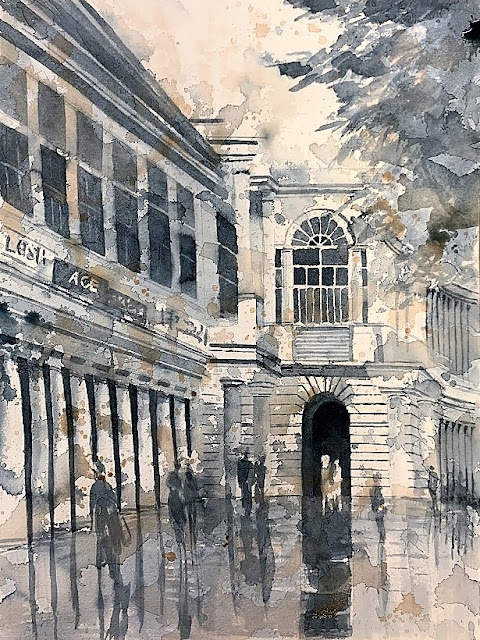
Watching DVDs
In this lockdown, I have decided to paint more on my own - be it going out for plein air (harder to do without a companion) or at home (harder to do anyway :-( ). I cleaned up my desk after my last project and I put my tabletop easel on the wiped-down surface. Now, from across the room, I feel the tidiness invites me - the easel with a blank sheet of watercolor paper, a clean bowl of water, and paints and brushes set up on the right. Now I don't need to set up from scratch and only need to know what to paint.
Which isn't always easy.
Typically watching YouTube videos of artists I like inspires me to no end. Who better, then, than Charles Reid? My artist teacher-cum-friend Bill Dunn mailed me two DVDs from his personal collection to watch during this quiet time. One of them isn't available in any library, nor through Link+. It is Charles Reid's English Watercolour Sketchbook. I loved watching it, and was inspired to paint like him - alla prima - and not in layers. I did these from some pictures I took in Cuesta Park some months ago. My hand is not as light and watery as his. I also feel the background tree is too strong and needs to be in a different plane. But I am pleased with the pattern on the page. I do think I need to give it another go though, to fix what needs fixing.
Maybe a black and white value study is in order to work out the shapes first - and have a light tree with dark shadows to define the highlights on the man's right side, and the dog.


Comments
Post a Comment