Carving
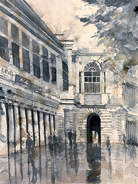
Another similarity between architecture and watercolors is starting big, and then carving out what you need. In architecture, in creating new space, first, the silhouette (massing) must be explored. Then, the smaller shapes (rooms) are carved out within that.
In art/composition, similarly, the big shapes come first. Examining the shape of the silhouette, and the ensuing negative space it generates, is the best analogy. Then, within it, smaller shapes are created - carved out like rooms, some negative, some positive, making a jigsaw that in total equals the silhouette - the house, or the shape the painting takes on the paper.
Of course, architecture is 3-dimensional, but must be explored on paper in 2D. Art is 2D, and paradoxically, represents depth and space - the illusion of 3D. How interesting is that!
This is from a value study I did of my daughter in Lisbon. The brilliant light on her as it came in through the archway, and created patterns of light/shadow in perspective behind her, and how it melded with the lightest parts of her - created very intriguing shapes.
In the watercolor - a color study for now - I think I need to distinguish her from the receding pattern of shadows. Perhaps the latter ought to get lighter in value and cooler as they recede. Then she is the focal point - darkest darks, and lightest lights.
In art/composition, similarly, the big shapes come first. Examining the shape of the silhouette, and the ensuing negative space it generates, is the best analogy. Then, within it, smaller shapes are created - carved out like rooms, some negative, some positive, making a jigsaw that in total equals the silhouette - the house, or the shape the painting takes on the paper.
Of course, architecture is 3-dimensional, but must be explored on paper in 2D. Art is 2D, and paradoxically, represents depth and space - the illusion of 3D. How interesting is that!
Michangelo's response when asked how he sculpted David:
"You just chip away everything that doesn't look like David."
This is from a value study I did of my daughter in Lisbon. The brilliant light on her as it came in through the archway, and created patterns of light/shadow in perspective behind her, and how it melded with the lightest parts of her - created very intriguing shapes.
In the watercolor - a color study for now - I think I need to distinguish her from the receding pattern of shadows. Perhaps the latter ought to get lighter in value and cooler as they recede. Then she is the focal point - darkest darks, and lightest lights.


Comments
Post a Comment