Techniques
There are so many techniques for different effects in watercolor. I know many in theory, but I am not natural or instinctive enough - yet - to know when to use what, or even to remember to use them. I played with wateriness a few weeks ago, yet I still forget that I should use it.
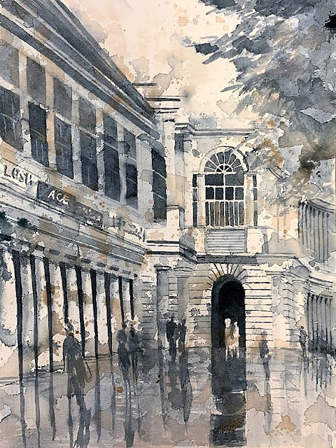
This painting looks pretty granulated and opaque - maybe the Burnt Sienna I had was too opaque or more semi-transparent than transparent. That is another thing I need to do - learn about the characteristics of the colors in my palette.
After the success of the process behind Hidden Villa Hostel, I am taking my value study more seriously and spending more time in the planning, before the painting. Also I learned that doing a painted value study in layer form - using Payne's Gray and covering everything but white, and then adding the darks - is counterintuitive to understanding the play of shapes. In coloring the value study, it is easier if I do it in pencil, and get to the value I want right away - the impact is greater than the slow build-up of layers with paint. To me, this is true even though I will paint in layers.
First I took a picture of Los Altos Grill, then cropped it until the shapes felt right. Then I did the value study, then several color palettes before settling on three colors - Cerulean Blue, Aureolin Yellow, and Burnt Sienna for the final palette. I like my value study a lot - maybe I will attempt another painting with a different color palette.


Comments
Post a Comment