SFMoMA - the big one
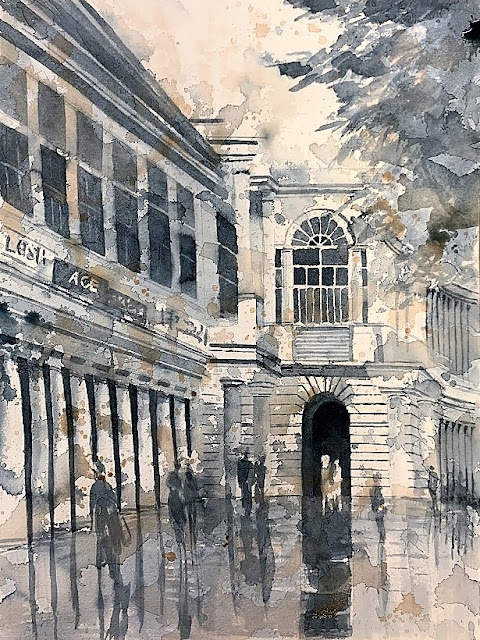
Doing color studies helps me visualize the harmony of the colors. Surprises still happen with color mixing on the paper, but they are good surprises. I do think that the last color study had a better "fill" - the figures were larger relative to the space, and there were less interstitial spaces. One change I made from the color studies to this larger painting was the orientation of the space. In the studies, the space is oriented 45deg, resulting in an isosceles triangle in the top right, and more dizziness for the viewer [and artist :-( ]. This shows a 30-60 triangle and shapes are more irregular as a result of the 30deg orientation. I do love the grays in the sidewalk - all from three colors. In fact, the entire painting is done with three [unusual] primaries. The color harmony that results with a limited palette is just beautiful.


Comments
Post a Comment